Editorial Content Design
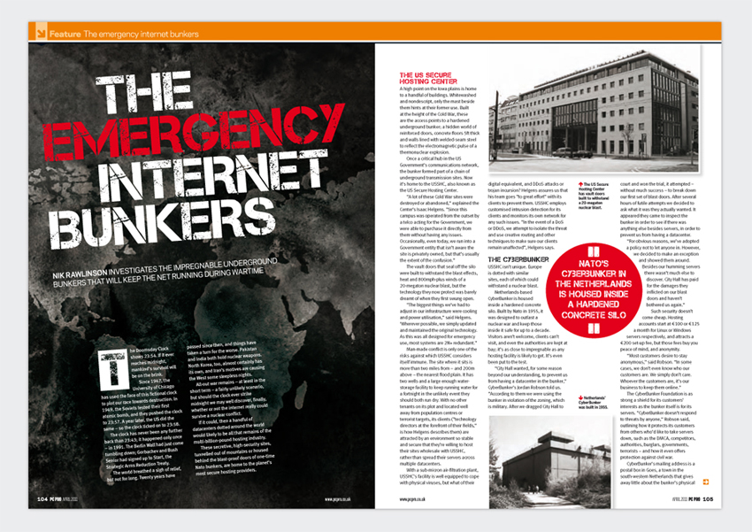 |
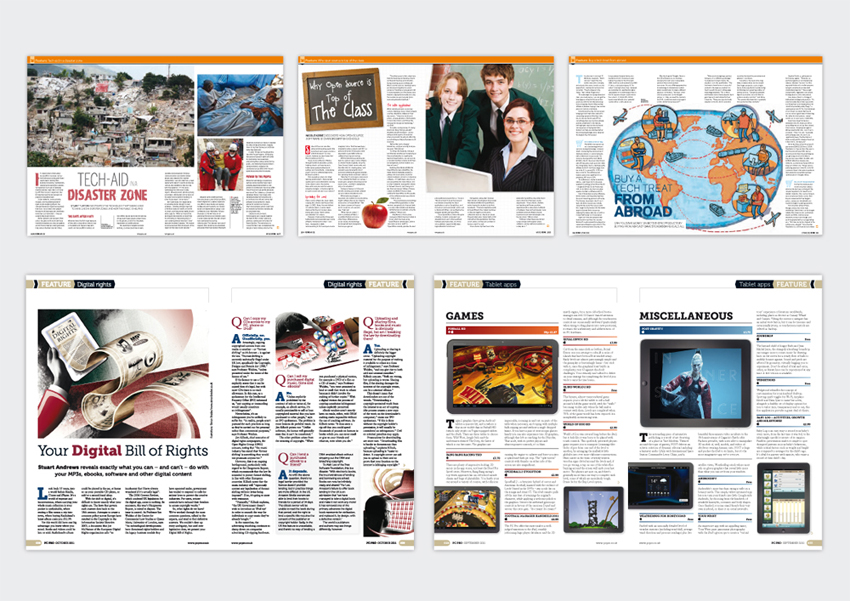
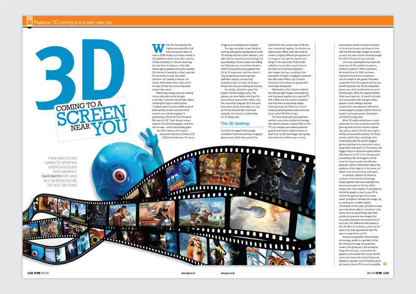
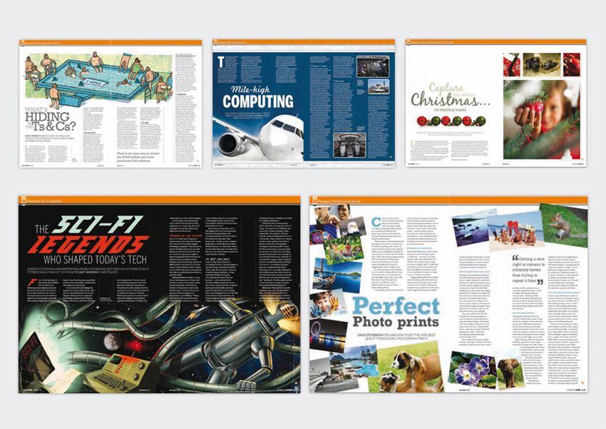
PC PRO Magazine A mixture of layouts produced for PC Pro Magazine. Credit: PC Pro magazine.
|
|
 |
A mixture of layouts produced for PC Pro Magazine. Credit: PC Pro magazine. llustrations: (Top right) Elly Walton, (Bottom left) Simon Brader Back to top |
|
 |
||
 |
A mixture of layouts produced for PC Pro Magazine. Credit: PC Pro magazine. llustrations: (Top left) Elly Walton, (Bottom left) The Red Dress Back to top |
|
 |
The IT PRO Report A 26 Page PDF document to be distributed to Cloud Computing professionals and readers of www.itpro.co.uk and www.cloudpro.co.uk The brief was to create a friendly, unintimidating yet professional document that would inform and discuss trends and features within Cloud Computing. The brief was approached with the intention of using a 'white-paper' feel, to ensure that the problem was solved effectively, sourcing and using primary and secondary imagery to illustrate features and interviews. Credit: IT Pro. Photography: Fotolia/Danny Bird. |
|
 |
||
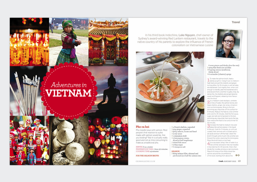 |
Grub Magazine I have worked on various issues of this whilst Credit: Bespoke.n Media. |
|
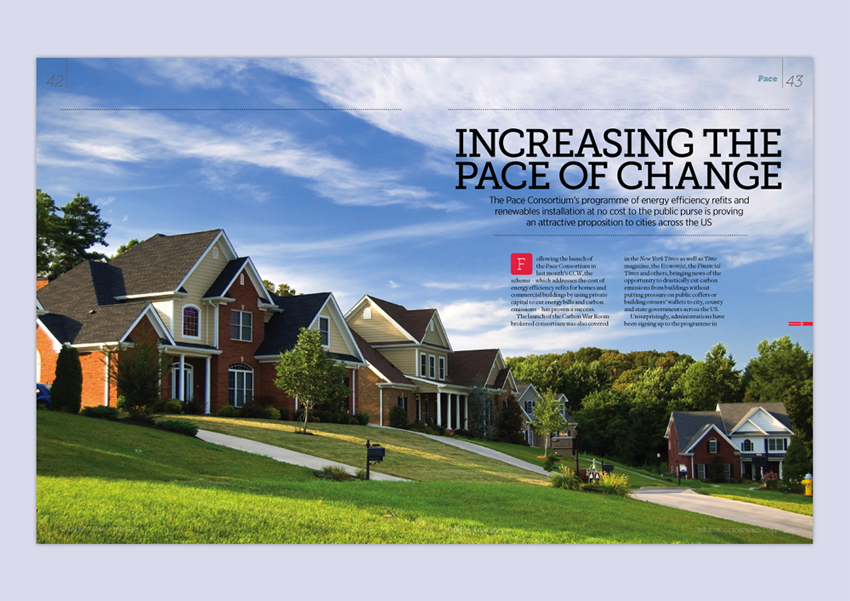 |
CCW Magazine I worked on various issues of this Climate control magazine. The magazine is produced digitally and distibuted electronically as PDFs. Credit: Bespoke.n Media. |
|
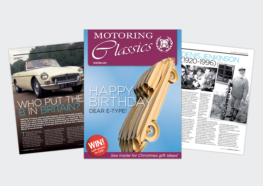 |
Motoring Classics Magazine - British Motor Heritage Whilst working as a freelancer at Bespoke.n Media, I was approached to design a 16 page Motoring brochure for the British Motor Heritage. The brochure is designed quarterly and distributed among many leading magazines such as Octane and MotorSport Magazine. The print run per issue is 90,000 - 100,000 copies. Credit: Bespoke.n Media. Photography: Sourced by Gordon Bruce www.gordonbruce.com |
|
 |
||
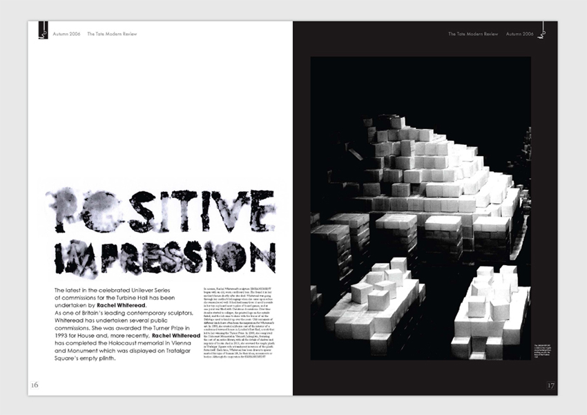  |
Tate Magazine Project
This was a self-study black and white magazine project that was designed as a free gift for visitors of the Tate Modern Art Gallery in Central London. The target audience were members of the public, and so I focused the magazine on the Tate and the surrounding areas to encourage visitors to broaden their trip to the Tate. I widely explored the use of bold and creative typography, experimenting with medias and shapes, to reflect a dynamic and engaging feature about the Rachel Whiteread exhibition. Photography: Sarah Ratcliffe. |