 |
|
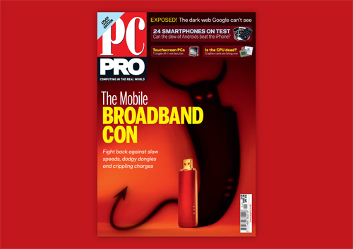
The Mobile Broadband Con
The brief for this feature-led cover, was to convey fear and confusion about purchasing Mobile Broadband, enticing the consumer to purchase the magazine. An image of a dongle was required to engage the consumer with hardware, and the cover image needed to relate to the PC PRO readership. The final image conveys the misguided and frustrated emotions that are experienced when you are pushed into purchasing something that is different from what you expected. The shadow was developed to add a humurous element to the cover. I art directed this project from start to finish.
Credit: PC Pro magazine. Photography: Danny Bird.
Reprographics: Jan Cihak
Back to top
|
 |
|
Online Banks exposed
This issue was to be bagged, so there was the added task of designing both the cover and bag artwork, providing a great opportunity to combine the two products, with the tear on the bag exposing the piles of money beneath, on the magazine cover. This was a great challenge to complete this brief, and there were more than a few hurdles to jump, to get the finished result.
The main ones being that Adobe Photoshop picks up on the security seals within the notes to prevent fraud (very clever stuff!) & the second being that permission was required from the Bank of England to replicate the use of Sterling Notes on the cover. Hurdles cleared – the end result is fantastic, and is a clear message for the subject.
Credit: PC Pro magazine. Photography: Danny Bird.
Reprographics: Jan Cihak
Back to top
|
 |
|
The Ultimate Guide to Digital Photography 3
This is a MagBook series, produced by technical experts for Dennis Publishing Ltd. This was the third Edition of the MagBook and intention was to ensure that it stood out from its previous version. By researching the cover trends of Photography Magazine sales, I concluded that Landscapes often work better on the covers than Hardware. I worked with a stunning and striking image and worked some hardware into the secondary sells, to engage the readers with the promise of practical Photography advice.
Credit: Dennis Publishing. Photography: Fotolia/Danny Bird.
Reprographics: Jan Cihak
Back to top
|
 |
|
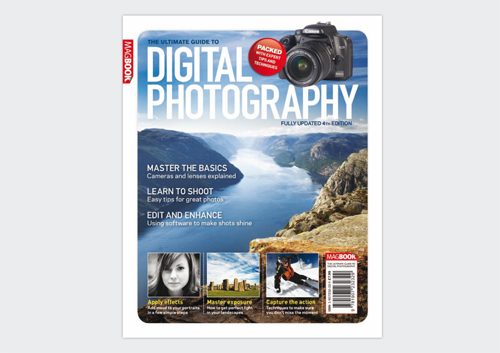
The Ultimate Guide to Digital Photography 4
Much again – a similar theory behind this to the previous version, experimenting with colour and typographic treatment for the secondary cover lines.
Credit: Dennis Publishing. Photography: Fotolia/Danny Bird.
Reprographics: Jan Cihak
Back to top
|
 |
|
ICT Reviews 2
This was a new launch for PC PRO that I was tasked with designing templates for. I based the design on the current (at the time) layout of the magazine, to ensure brand recognition.
I decided to go BIG on the iPad 2, due to its popularity and versatility. This shot was photographed to ensure that we exposed just enough of the screen and the cover to enhance the new features, distinguishing it from the earlier version. I chose to work with 3 colours for the cover elements, tying them in with each other, as I didn’t want to over complicate the striking image.
Credit: Dennis Publishing. Photography: Danny Bird.
Back to top
|
 |
|
ICT Reviews 3
There was very limited Art Budget for this edition, and so had to create the cover image from scratch using the cut-out photography that had been directed for the product shots. I wanted to create a shape that was engaging to the readers and that complimented the masthead, and allowed breathing room for the large headline. By incorporating a gradient background, I think that this image has come together well and conveys the message of a Buyers Guide group test.
Credit: PC Pro magazine. Photography: Julian Valesquez.
Back to top
|
 |
|
PRO VOKE – Kindle Book Cover.
A book cover for a Kindle Device for PC PRO. This was to promote an annual of tech stories and reviews, so the cover was designed to contain just a hint of Technology, whilst incorporating a high-contrast bold cover, which is vital as the Kindle only displays in black and white.
Credit: PC Pro magazine.
Back to top
|